Interview with Attiyah Rahman
Arc 2:There’s been a lot of usage of Anime or Anime aesthetic in recent years, and the rapidly growing Western audience for the industry is creating new dialogues and interpretations of Japanese media. Where do you situate yourself in the interpretation of cultural media?
Rahman:
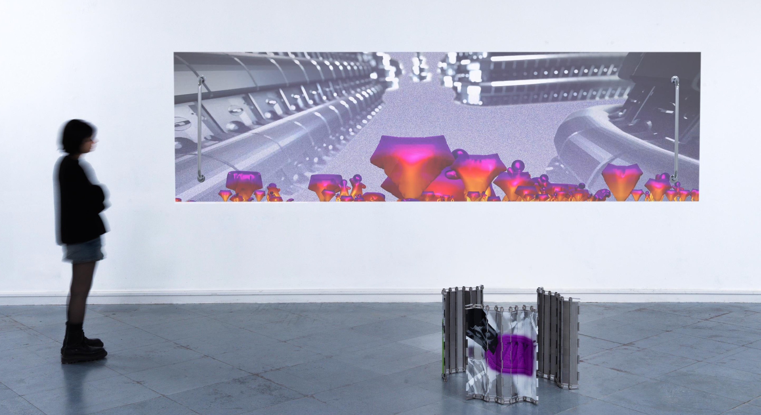
I think the position in which I situate myself and my work changes semi-frequently, purely because of the nature of the medium I engage with, and the variety of contexts that are connected to and inform it. At the time when I was first exploring anime and manga within a contemporary fine-art context, the medium still felt quite unknown and not as recognised and mainstream as it is at current. It felt somewhat easier to appropriate things. I think it’s quite difficult now to make critical work that embodies familiar anime aesthetics, especially when you know the majority of your audience will be viewing the work through an online platform, where everything you see and engage with is just an image of something. I’d like to think I situate myself and my work somewhere in-between the question, while also existing in a place just outside of it; the visuals are familiar enough to be associated with anime and manga, yet they are reduced just enough to be considered instructional or semiotical. While the majority of my early work took direct inspiration from typical anime aesthetics, my most recent development of the last three years combines minimalist corporate elements (originally inspired by the figurative visuals located within aircraft safety manuals) with a loosely connected Shojo manga style. Similar to the work of artists Julian Opie or KYNE, I adopt a recurring character who is my muse, and in a way, I try to find ways to exhaust his image through repetition. I’m also influenced by the layering methods of traditional anime cell painting, yet from a digital perspective. I was drawn to the minimalist nature of thick rounded lines and solid colours for the fact that it is a highly precise style of drawing, and I like to play with how much detail or aliveness I endow my character with.
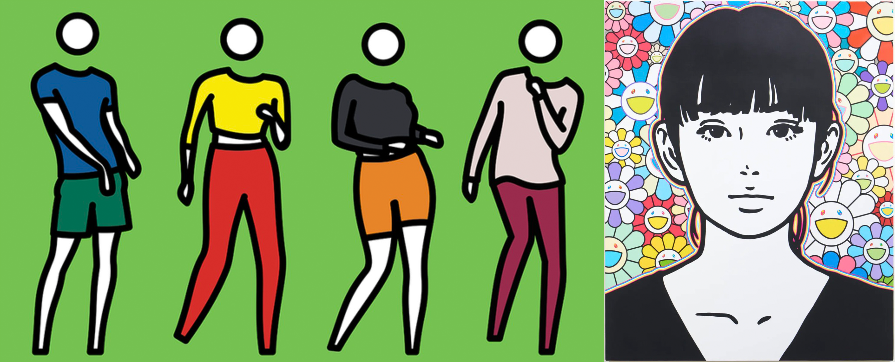
(left) Julian Opie, 2022 and (right) KYNE, 2021
Arc 2: The salaryman theme seemed like a deep dive into Japanese culture—what made you explore Japanese social contexts like that?
Rahman:
I’ve found there’s been a lot of recent popularity surrounding corporate aesthetics, particularly from a fashion-related lens. For me, this fixation also seems to exist within a specific decade, somewhere within the “when things were good” bubble (pre-2020 for starters). I left education two years ago and have been in full-time work since to support myself, while still trying to continue making my art in the background. I work in retail, and as a result it has made me attuned to consumer culture from a selling aspect, which filters into the work-culture theme as a whole. At current, I’m interested in the representations of these themes within film, art and other forms of media. I’m thinking of American Psycho (2000), The Secretary (2002), the work of Anna Uddenberg, the viral ‘Office Siren’ trend, and especially Kaneoya Sackiko’s long-standing interpretation of the salaryman, to give some examples. A lot of my work has an underlying discomfort to it, an impending threat, or a hidden force of sorts, internalised within the character or situation depicted, which is often connected to a power dynamic that extends into the relationship between the viewer and the work—who is controlling, or seducing who? I’ve always had a fascination for the figure of the salaryman within a Japanese context, as someone who is non-Japanese and grew up within a Western environment. The cultural difference will never not be interesting for me. I find the figure of the young man adorning the suit to be quite a romanticised image, and I’ve often located this same figure within high-fashion editorials, film and television, video-games and 1940s military aesthetics. I’m still exploring what this version of the ‘moe boy’ still really means to me, but perhaps he is just growing up.
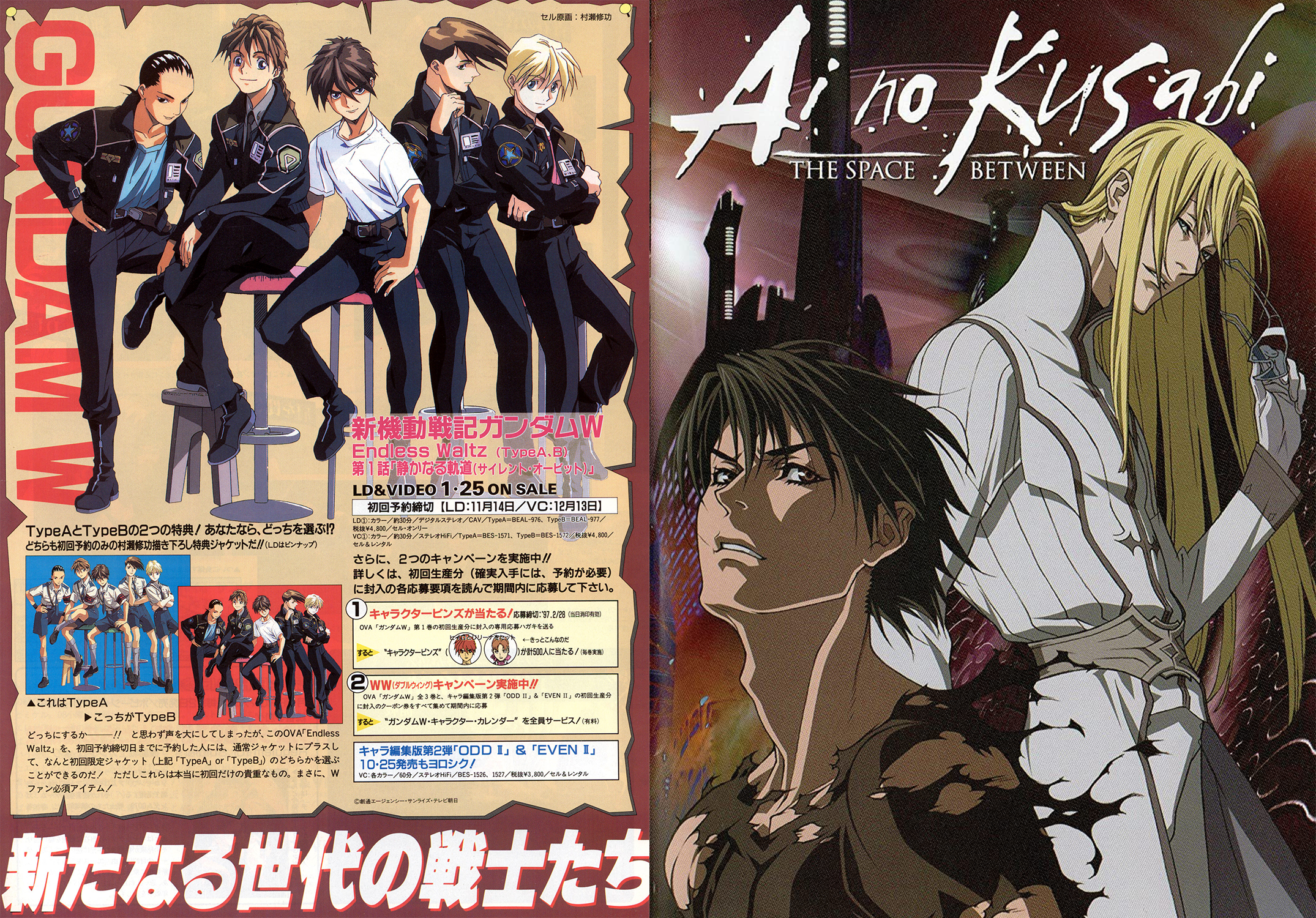
(left) Mobile Suit Gundam Wing, 1995 and (right) Ai no Kusabi, 2012
Arc 2: Why do you think the cute and harmless aesthetic is effective for discussions of currently urgent topics for you?
Rahman:
Within the context of the West’s fascination for cuteness within Japanese culture, the aesthetic is hugely popular and always will be, therefore it is widely recognised by many different communities. It’s also very digestible material, difficult to miss and quite easy to capture attention. The more I consciously work with cuteness and harmlessness, I think more about the urgency and the seriousness of the topics that sit beneath these surfaces. It’s important to not forget what this cuteness may truly embody, or where it came from. A similar example of this is the origin of Sanrio’s Hello Kitty, and how she became a super successful post-war product to help rebuild Japan’s image after WWII. For me, the aesthetic is closely related with ideas surrounding submission, power and threat; see-sawing dualities that seem to create more questions than answers, ones that often look to destabilise the rationality within my work, or provoke a kind of uncertainty. I ultimately use the cute and harmless aesthetic as a way to explore situations that may feel unsafe or considered taboo.
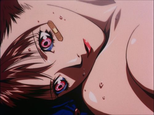
KITE, 1998